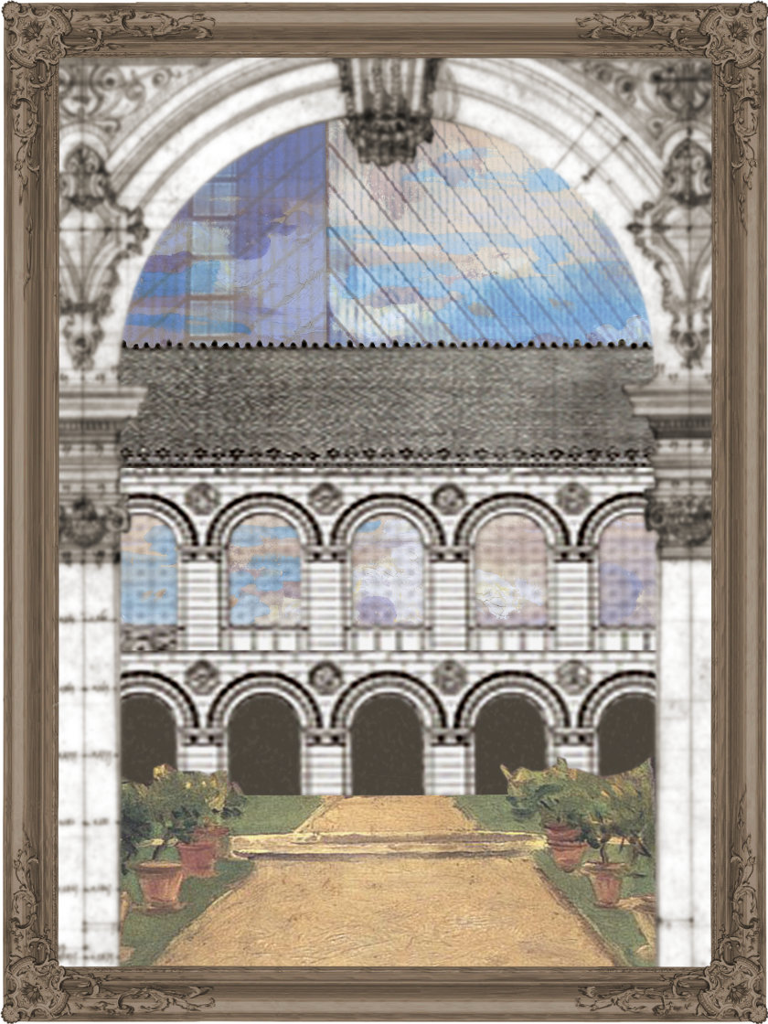


Copley Square started as an intersection in the residual spaces where Huntington Avenue's diagonal crashed into Back Bay's grid. A number of the resulting peculiar parcels remained unoccupied for long enough that an urban gathering space grew. In time, the city reacquired the undeveloped land to become an official open space. Alas, the avenue would not reroute until 1965, leaving the Square to fumble as two triangles split by a major thoroughfare. Furthermore, many of its early architectures medievally manoeuvred around their oblong lots, shattering the classical necessity of establishing squares with institutional edges. Copley Square — actually called Art Square at the time — could not really be considered a proper urban square at all. When McKim, Mead, and White designed the Boston Public Library in the 1880s, however, they sought to remedy Copley's imprecisions and create a piazza worthy of an Italian city-state.
McKim, the lead architect on the project, borrowed from an archive of classical architectural tropes when designing the novel building. While libraries had existed for millenia, none had been paid for and open to the entire public. McKim could not simply retell; he had to adapt. At first glance, the building could be a Renaissance palazzo: its rooms wrap a courtyard complete with balconettes, colonnades and a fountain; the facades, with their rusticated base, follow tripartite symmetries; a grand stair leads to the piano nobile that houses the barrel-vaulted reading room. Continuing with the (neo-)Roman lead, the building's predominant structural motif are its Guastavino vaults. But while these forms stem from classical structures, McKim has repurposed them to fit his modern typology. This palazzo, after all, is not designed to keep the masses at bay. Its courtyard does not provide the passive cooling it would along the Mediterranean (in fact, it is unusable half the year in snowy Massachusetts), and instead provides a quiet reading space near a busy intersection. Its otherwise aristocratic facade opens to its urban condition with large windows that flood reading spaces with natural light. Even the piano nobile exists only as a gesture: the ground floor contains numerous active public spaces to serve the courtyard, which pushes the service spaces to the rear of the building across all levels. Though classical in its forms, the library breaks from the premodern idea of architectural genre1 — the marriage of a building's form and its program — to create a modern structure in a neoclassical style.
Every element in the Boston Public Library is on loan. McKim manipulates the classical vocabulary into a building at once both derivative and unprecedented. Amidst the many architectural voices around Copley, McKim, in the hushed voice of a librarian, an unobtrusive institution or a stone-faced archive, repeats history once more. The ancient Greco-Romans offered an initial architecture on which the Renaissance would develop and embellish. With his Beaux-Artes neoclassicism, McKim once again reinvents the wheel. But each iteration sees deviations, and the Boston Public Library has reached a point where it masquerades as an antiquity while its innards reveal a more enlightened outlook. To McKim, the style he employs is not a design crutch; it is a means by which he may unlock new forms of architecture. Its aesthetic is secondary to what its tools allow. Ancient forms find new functions while retaining familiarity. The old becomes the new.
Reading in the shaded summer loggia of the library, the city almost slips away. Only 200 Clarendon, Cobb's reflective Hancock, peaks over the roof incessantly to remind of the city's existence. Its sharp, minimalist form shatters the regimented order of the library. It silently declares that less is everything as it looks down on the library's ornament. But there are thousands of skyscrapers. There was once only one public library.
This entry continues in Reflections.
# Date [Return to] Title
500+ Ongoing Essays
550 May 2023 Platform Gamification
504 December 2022 On the Grid
518 December 2022 A Suspended Moment
A–Z Ongoing Glossary
G September 2022 – as in Girder
F May 2022 – as in Formal
* April 2022 – Key
E February 2022 – as in Entablature
D November 2021 – as in Duck
C August 2021 – as in Czarchitect
B June 2021 – as in Balustrade
A April 2021 – as in Aalto
0–15 December 2020 Journal
15 November 2020 Practice (in Theory)
14 October 2020 Alternative Narratives beyond Angkor
13 September 2020 Urban Preservation in Cuba
12e August 2020 Conversation on Copley Square: Summations
12d July 2020 Conversation on Copley Square: Conceptions
12c June 2020 Conversation on Copley Square: Reflections
12b June 2020 Conversation on Copley Square: Nonfictions
12a May 2020 Conversation on Copley Square: Foundations
11 May 2020 Out of OFFICE
10 March 2020 Hudson Yards from the High Line
9 March 2020 Metastructures
8 February 2020 Form, Program and Movements
7 February 2020 Life in the Ruins of Ruins
6 January 2020 The Urban Improvise
5 January 2020 Having Learned from Las Vegas, or Moving past Macau
4 December 2019 A Retrospective on the Decade's Spaces
3 December 2019 The Captive Global City
2 November 2019 Temporal Layers in Archaeological Space
1 November 2019 Contemporary Art Museums as Sculptures in the Field
0 Undated Manifesto: A Loose Architecture
© 2019 – 2023 Win Overholser
Comments
Loading comments...
Powered by HTML Comment Box.