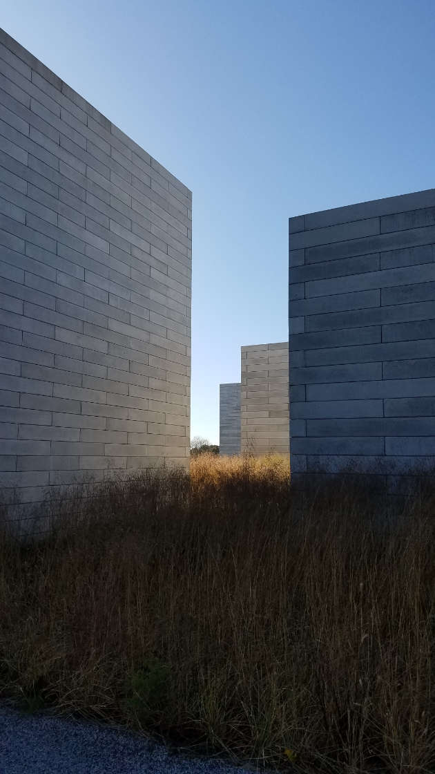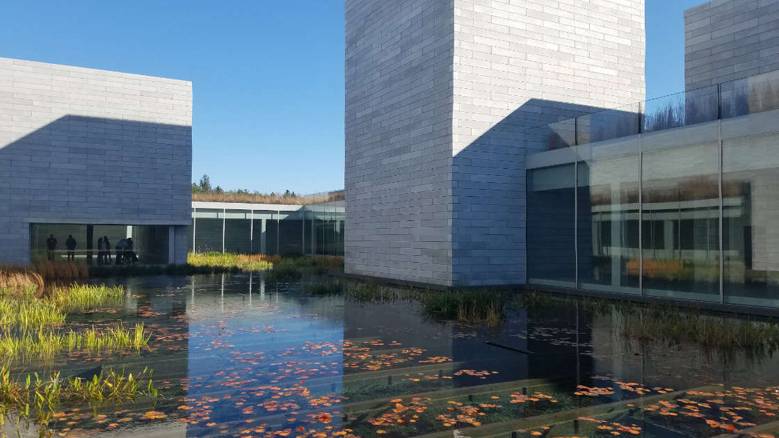

Thomas Phifer's Glenstone addition stands as a number of off-white cubes in the rolling hills of Maryland.A The winding approach, littered with sculptures that sit in expansive and expanded1 fields (nearly 300 acres worth, they claim), slowly reveals Phifer's 'pavilions'. Each contains a gallery, most of which are dedicated to a single artist's installation. "Those must be the museum," I overhear a visitor ahead declare. But with all the sculptures that verge on architecture here — including three small, stone houses by Andy Goldsworthy — how can one be so sure?

White cubes have been synonymous with gallery spaces since the earliest days of the museum. Within, art pieces must speak for themselves: they've no context to lean on. A museum is an institution, so it follows that its artworks must be institutionalized. The phenomenon of the blank box, however, has kept for the most part to the inside of the museum. Le Corbusier, whose white cuboids persevere in the imagery of modern architecture, can offer at best a grey cuboid for a museum.2 This continues through the postmodern canon despite the obvious duck-ness of the square, white-walled museum (and what's an institution without a couple quacks?). Here we are: contemporary art museums waddle to the rescue.3 Glenstone, SANAA's New Museum, Zumthor's Kunsthaus Bregenz and DS+R's The Broad all play off the archetypical gallery form.
But wait! What kind of white cubes are these? Why now return to a trope that exhibition design views as ancient? In fact, have architects not offered circles, spirals, flowers and sailboats in which artists may display their work? Sculpture may frequent architecture's spatial territory, but architecture almost always impedes on the performance, display or review of any artwork. This is nothing new, and contemporary art museums know so as they reemploy the white cube. At the New Museum, perforated aluminium mesh hangs with gaping corners over corrugated panels, a tactic that abstracts the austere stack into an abstruse act; with Zumthor, floating frosted glass overlaps gently off exposed interiors, creating an ephemeral mass; and at the Broad, well, enough said. Glenstone offers the cleanest cut cuboids of the four, but even it plays a few tricks. The large masonry of which the facades are comprised (alongside unbelievable panes of glass)4 is no masonry at all. Rather, polished precast concrete panels emulate cut stone by turning corners and forming quoins.C,5 What appears as a sturdy cube of stone is no more than a rain screen. What comprises the cube in reality? Such sordid information is not on display at this refined institute. It's the concept that matters, not the execution.


Contemporary art is no longer modern art (can we still say it ever was?). Modern art grew up with and rebelled against the white wall gallery; contemporary art grew up with modern architecture. Modern art sought to blur boundaries, mix media and trash traditions; contemporary art inherits modern boundaries, media and traditions. The white cube of the modern era, scattered into fragments, becomes subject to its own criticality. Its narrative trembles. A loss of focus occurs, and contemporary art dances in those uncertain edges. The contemporary art museum offers a white cube as a gesture of good faith, of shared history and of shared contemporaneity.D All four museums mentioned offer open, orthogonal, illuminated spaces. They don't all whitewash the walls (i.e. they don't rewrite the relationship of art and the museum), but they also don't advance their architecture into the art they contain. In short, their cubes are not cubes at all. They are fuzzy and confounding.E They are flexible yet concrete.F They are forms without confines.G They are, firstly and finally, contemporary art museums.


# Date [Return to] Title
500+ Ongoing Essays
550 May 2023 Platform Gamification
504 December 2022 On the Grid
518 December 2022 A Suspended Moment
A–Z Ongoing Glossary
G September 2022 – as in Girder
F May 2022 – as in Formal
* April 2022 – Key
E February 2022 – as in Entablature
D November 2021 – as in Duck
C August 2021 – as in Czarchitect
B June 2021 – as in Balustrade
A April 2021 – as in Aalto
0–15 December 2020 Journal
15 November 2020 Practice (in Theory)
14 October 2020 Alternative Narratives beyond Angkor
13 September 2020 Urban Preservation in Cuba
12e August 2020 Conversation on Copley Square: Summations
12d July 2020 Conversation on Copley Square: Conceptions
12c June 2020 Conversation on Copley Square: Reflections
12b June 2020 Conversation on Copley Square: Nonfictions
12a May 2020 Conversation on Copley Square: Foundations
11 May 2020 Out of OFFICE
10 March 2020 Hudson Yards from the High Line
9 March 2020 Metastructures
8 February 2020 Form, Program and Movements
7 February 2020 Life in the Ruins of Ruins
6 January 2020 The Urban Improvise
5 January 2020 Having Learned from Las Vegas, or Moving past Macau
4 December 2019 A Retrospective on the Decade's Spaces
3 December 2019 The Captive Global City
2 November 2019 Temporal Layers in Archaeological Space
1 November 2019 Contemporary Art Museums as Sculptures in the Field
0 Undated Manifesto: A Loose Architecture
© 2019 – 2023 Win Overholser
Comments
Loading comments...
Powered by HTML Comment Box.